
Quick Answer
The best law firm websites make three things obvious: what the firm handles, why a client should trust it, and how to start. Morgan & Morgan, Cooley, Latham & Watkins, Wilson Sonsini, and Kilpatrick Bullentini each do this at their own scale. Clear practice area pages, real attorney bios, a simple intake path, and fast pages set them apart.
Honesty is part of the design: Nevada’s Rule 7.1 says a lawyer “shall not make a false or misleading communication” about services.
Someone searching for a lawyer is rarely having a good day. They’ve been hurt, sued, served, or are about to sign something that scares them. They land on your site with one question: can this firm help, and can it be trusted?
The best law firm websites answer that in seconds, whether the firm handles personal injury, family law, or corporate law. The rest make a stressed person dig, and that person goes back to the search results.
What makes a law firm website work
A law firm website has two readers. One is a prospective client deciding whether to call. The other is a referral source, such as another lawyer, checking your credentials before passing a name along. Both want the same things, in a different order.
Here’s what the strongest law firm websites share.
- Practice areas that match how clients think. A person searches for "car accident lawyer," not "tort litigation." Each practice area gets its own clear page.
- Attorney bios that build trust. Real photos, bar admissions, education, and the kinds of matters each lawyer handles.
- One obvious way to start. A phone number, a short intake form, and a clear statement of what happens next.
- Proof that stays honest. Results, reviews, and recognition that follow your state’s advertising rules.
- Speed and clarity on a phone. Many people reach out right after something goes wrong, from wherever they are.
Think of the site as your reception area. A good one is calm, organized, and tells a visitor they’re in the right place. A cluttered one makes them wonder what else the firm lets slide.

Key Takeaways
The best law firm websites have a few things in common:
- Client language: Practice area pages use the words clients search for, not the words on a court filing.
- Trust in the bios: Attorney pages do much of the selling, so they need real detail and real photos.
- Clear intake: A short form and a visible phone number beat a long questionnaire.
- Ethical proof: Results and reviews follow your state’s attorney advertising rules.
Law firm website examples and what to copy
These are real, live law firm websites. Four we reviewed from the outside, and one belongs to a client of ours. Two serve individuals and three serve businesses, because the right design depends on who hires you. Each section ends with an idea any firm can borrow.
Morgan & Morgan: intake that starts on the home page
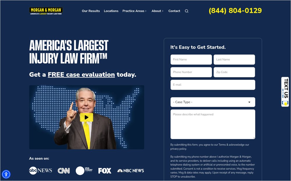
Morgan & Morgan (forthepeople.com) is a personal injury firm, and its website is built to turn a visit into a case evaluation. The intake form sits on the home page, above the fold.
What it does well:
- The header shows a phone number with "Call Now – Open 24/7," so people know someone will answer.
- A short form asks for name, phone, zip code, email, and case type, and nothing more.
- The practice areas menu covers dozens of case types, each linking to its own page.
- "Our Results," "Testimonials," and "The Case Process" each have a place in the menu.
- An "En Español" link and a mobile app serve clients who need them.
What to copy: put a short intake form where people can see it, and tell them what happens after they hit submit. A small firm doesn’t need 24/7 phones, but it should say when someone will call back.
Cooley: useful resources that bring clients back
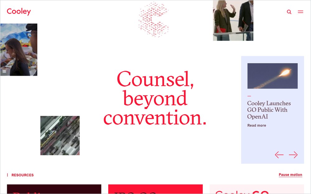
Cooley (cooley.com) serves startups, growth companies, and investors. Its website reads more like a resource library than a sales pitch.
What it does well:
- Cooley GO offers guides and financing data for founders who aren’t clients yet.
- Hubs for public companies and companies heading toward an IPO speak to specific buyers.
- News and insights are dated and current, which signals an active firm.
- The main menu stays short: About, People, Services, Insights, and Careers.
What to copy: give your future clients something useful before they hire you. A small business firm could publish plain-language guides on forming a company or signing a lease. That content builds trust and gives search engines something to rank.
Latham & Watkins: clean navigation for a huge firm
Latham & Watkins (lw.com) is a global firm, yet its home page stays simple. The top menu has just a handful of choices, and a search bar sits right beside them.

What it does well:
- Main navigation is limited to People, Capabilities, Achievements, Insights, and Global Citizenship.
- Language options include Chinese, French, German, Italian, Japanese, Korean, and Spanish.
- A "Book of Jargon" resource explains legal and financial terms in plain words.
- Search is always one tap away, which matters on a site this large.
What to copy: keep your main menu short, even if your firm does a lot. Group practice areas under one clear heading, and add site search once you have more than a few dozen pages.
Wilson Sonsini: practice areas and industries side by side
Wilson Sonsini (wsgr.com) serves technology and life sciences companies. Its menu lets visitors browse by practice area or by industry, which matches how business clients shop for counsel.

What it does well:
- Practice Areas and Industries sit next to each other in the main menu.
- Experience, People, and Insights are top-level items, so proof is easy to find.
- Alerts and podcasts show the firm’s thinking on current issues.
What to copy: let clients find you the way they think. A business owner might look for "construction" before "contract disputes." Offering both paths helps more people land on the right page.
Kilpatrick Bullentini: a Nevada firm doing the basics right
Kilpatrick Bullentini (kilpatrickbullentini.com) is a personal injury firm serving Northern Nevada. It’s also a White Peak SEO client, which is why we know the site well. We included it because most readers run a firm closer to this size than to the four above.

What it does well:
- The phone number sits in the header on every page, and the hero button offers a free consultation.
- Each of the seven practice areas, from auto accidents to dog bites, has its own page.
- The intake form asks for five things: first name, last name, email, phone, and a message.
- Case results carry a plain disclaimer: "Past results do not guarantee, warrant, or predict future cases."
- The footer labels the site as attorney advertising and says where actors appear in photos.
What to copy: you don’t need a national brand to get the fundamentals right. One page per practice area, a short form, and results with a clear disclaimer satisfy both Nevada’s Rule 7.1 and a worried client.
| Website | Who it serves | Standout feature | Idea to borrow |
|---|---|---|---|
| Morgan & Morgan | Injured individuals | Intake form on the home page | Short form plus a clear "what happens next" |
| Cooley | Startups and investors | Cooley GO resources | Useful guides for future clients |
| Latham & Watkins | Global companies | Short menu and search | Keep navigation simple as you grow |
| Wilson Sonsini | Tech and life sciences | Browse by practice or industry | Offer two paths to the right page |
| Kilpatrick Bullentini | Injured individuals, Nevada | Results with a plain disclaimer | Get the basics right at any size |
A law firm website sells trust first. Everything else follows from it.
The pages that quietly win clients
The examples above also share pages that rarely get attention in design reviews. Clients find them while they’re deciding, and each one removes a reason to wait.

A "how we work" page
People who’ve never hired a lawyer don’t know what happens after the first call. Morgan & Morgan’s "The Case Process" page walks through it. A short page that covers the first meeting, fees, and timeline lowers the friction of reaching out.
A fees page in plain words
Cost is one of the first worries a new client has. You don’t need to publish rates, but you can explain how you bill. Contingency, flat fee, and hourly work each deserve a clear sentence about what they mean.
Office and contact details
A local client wants to know where you are and whether they can meet in person. List the address, parking, hours, and how fast the firm replies. If you meet by video, say so.
An FAQ that answers real questions
Every firm hears the same questions on intake calls. Answer them on the site, in short paragraphs, without giving legal advice. Those answers help clients decide, and they give search engines and AI tools clear text to quote.
Common mistakes on law firm websites
Most weak law firm websites have the same handful of problems. Each one is a spot where a ready client leaks away.

One page for every practice area
Lumping every service onto a single "Practice Areas" page hurts twice. Clients can’t tell if you handle their problem, and search engines have nothing specific to rank.
Give each main practice area its own page with its own questions and answers. That holds for criminal defense, employment law, and immigration law alike. If you run PPC ads, send each ad to the matching practice area page, not the homepage.
A template that looks like every other firm
Many lawyer websites start from the same template: a gavel, a courthouse photo, and a stock handshake. A template isn’t the problem. Using it without changing the structure, words, and photos is. Prospective clients compare several firms in one sitting, and identical homepages blur together.
Bios that read like a résumé
A list of degrees isn’t a reason to hire someone. Good bios explain what each lawyer handles, who they work for, and how they approach a case. Add a recent photo and keep bar admissions current.
Claims that cross the line
Attorney advertising rules apply to websites. Under Nevada’s Rule 7.1, a statement can be misleading even when it’s true, if it leaves out a fact a reader needs. Superlatives, unverified awards, and past results without context can all raise questions.
This is general information, not legal advice. Your state bar’s rules decide what your site can say.
Thin content written for search engines
Pages stuffed with city names and keywords read badly and help no one. Google’s guidance on people-first content says its systems favor content "created to benefit people." Write each page to answer a real client’s questions, and the search value follows.
Slow pages and broken forms
A form that fails silently can cost a firm a case it never knew about. Slow pages do the same, more quietly. Google’s Core Web Vitals guidance says main content should load within 2.5 seconds for a good experience. Test your intake form every month, on a phone.
No clear next step
Some sites end every page with a generic "Contact us." Tell people exactly what to do and what happens next. For example: call or fill out the form, and a member of the team will reply.
Now ask yourself: could a stressed person on your site find the right practice area and contact you in under a minute?
How to apply these lessons to your firm’s website
You don’t need a global firm’s budget to use what these sites do well. Start with the changes that touch the most visitors.
- Write down the five practice areas that bring in the most work, and give each its own page.
- Rewrite each page in the words clients use, with the questions they ask at a first meeting.
- Update every attorney bio with a real photo, admissions, and the matters each attorney handles.
- Add a short intake form and a phone number to every page, and test both.
- Review results, reviews, and awards against your state’s advertising rules.
- Check the site’s speed on a phone and fix the slowest pages first.
If you’re planning a new site, law firm web design built around intake makes every later step easier. If your site is new but nobody finds it, local SEO services help clients in your area reach it.
Keep the site healthy after launch, too. Plugins, forms, and security updates need regular care, and a website maintenance plan keeps a broken form from costing you clients.
Your website is often the first meeting. Make it feel like a good one.
Best law firm websites FAQs
What should a law firm website include?
A law firm website needs a page for each main practice area, attorney bios with photos and admissions, and a clear way to make contact. Add the address and hours, a short intake form, and reviews or results that follow your state’s rules. Content that answers client questions completes it.
How much does a law firm website cost?
At White Peak, website prices start at $1,500, and most websites cost $3,000 to $10,000. A law firm site’s price depends on the number of practice area pages, attorney bios, intake integrations, and who writes the content. Every site is custom, so the quote follows the scope.
Can a law firm website show case results?
Many states allow case results with conditions, such as disclaimers that past results don’t guarantee future outcomes. The rules differ by state, so check your state bar’s advertising rules before publishing results. This is general information, not legal advice. A lawyer familiar with your state’s rules can confirm what applies.
Do law firms need a blog?
A blog helps when it answers real client questions in plain language. Those posts can rank in search and give clients a reason to trust the firm before they call. A blog filled with thin, keyword-heavy posts does little. A few strong, accurate guides beat a weekly stream of filler.
How can a law firm website get more leads?
Make it easy to start: a visible phone number, a short form, and a clear next step on every page. Give each practice area its own page in plain language. Then help people find you with local SEO, reviews, and fast mobile pages. Test the intake path often.
Getting help in Reno
If you take one thing from this, build your law firm’s website around trust and a clear first step.
White Peak is a web design and digital marketing agency in downtown Reno. We build websites for law firms and other professional services firms in Reno, Sparks, Carson City, Truckee, and nationwide.
If you want web design in Reno that helps clients choose your firm, book a free consultation and we’ll talk through what your site needs.