Quick Answer
The best restaurant websites get a hungry person from “where should we eat?” to a booked table or a placed order in a few taps. They show the menu as real text, put reservations and online ordering on every page, and list hours and location clearly. Sweetgreen, Shake Shack, Eleven Madison Park, Noma, and Momofuku each do this well.
Phones decide it: Google’s mobile-first indexing guide says it uses “the mobile version of a site’s content” for indexing and ranking.
At 6:15 on a Friday, two people stand on a sidewalk, phones out, deciding where to eat. They’ll give each restaurant website about as long as it takes to read a street sign.
In that moment, nobody cares about your origin story. They want the menu, the hours, the address, and a way to book or order. The best restaurant websites hand all four over without a fight.
What makes a restaurant website work
A restaurant website has one main job: turn hunger into a visit or an order. Every design choice either helps that happen or slows it down.
Here’s what good restaurant websites share, from a corner cafe to a fine dining room.
- A menu you can read on a phone. Real text, not a blurry photo or a PDF that needs pinching and zooming.
- One-tap reservations or ordering. A booking or order button in the header, on every page.
- Hours, address, and phone up front. The basics sit on the homepage, not three clicks deep.
- Food photography that loads fast. A few strong, compressed photos beat a slow slideshow.
- A brand you can feel. The site looks and sounds like the dining room, so the visit matches the promise.
Think of the website as your host stand. A good host greets people, tells them how long the wait is, and walks them to a table. A slow or confusing site is the host who wanders off.
Key Takeaways
The best restaurant websites share a few habits:
- Menu as text: A text menu loads fast, reads well on a phone, and gives search engines words to understand.
- Book or order anywhere: A reservation or online ordering button sits in the header of every page.
- Basics first: Hours, address, and phone are on the homepage, where hungry people look.
- Fast photos: A handful of compressed, high-quality photos sell the food without slowing the page.
Restaurant website examples that get it right
These are real, live restaurant websites we’ve reviewed. We didn’t build them. Two are fast-casual brands built for ordering, and three are dining rooms built for reservations. Each pattern works for an independent restaurant, too.
Sweetgreen: the menu is the website
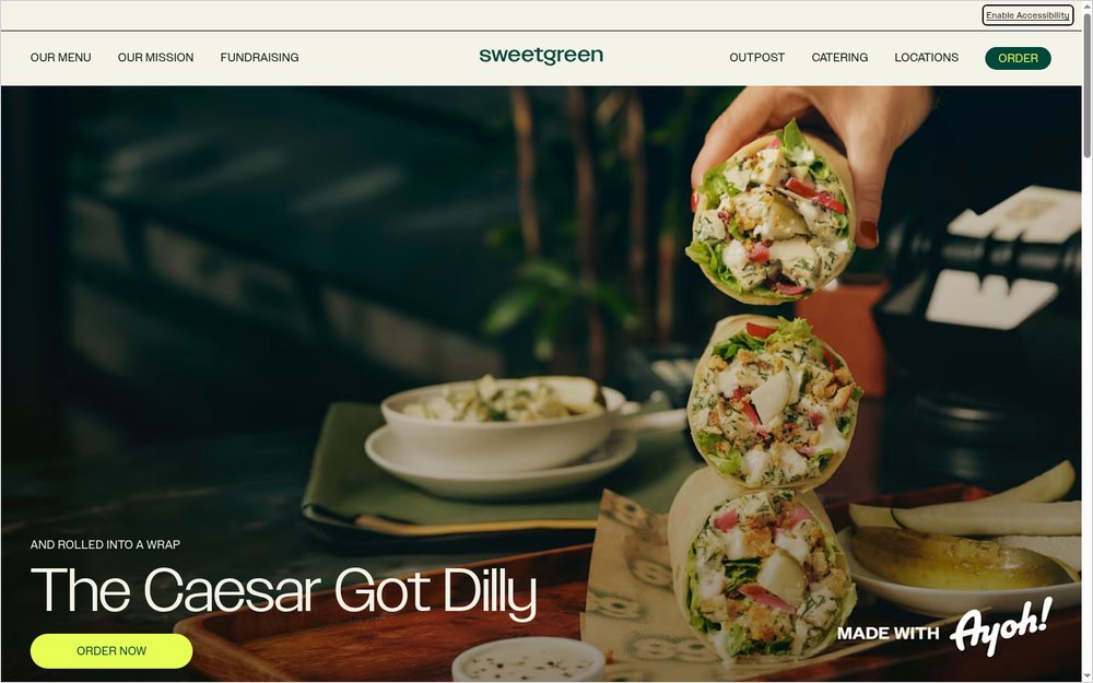
Sweetgreen (sweetgreen.com) treats its menu as the main event. Scroll down the homepage and you’re reading dishes, not marketing copy.
What it does well:
- Each dish lists its ingredients in plain words, from roasted chicken to the dressing.
- Allergen notes sit right under each item, such as "Contains milk, eggs."
- An "Order now" button sits beside every dish, so the decision and the action happen together.
- Menu, Locations, Catering, and Order make up a short top menu, with an app download nearby.
- An "Enable Accessibility" option appears at the top of the page.
What to copy: put the menu on your homepage, as text, with a way to order right next to it. If you serve dishes with common allergens, say so on the menu.
Shake Shack: everything a regular needs
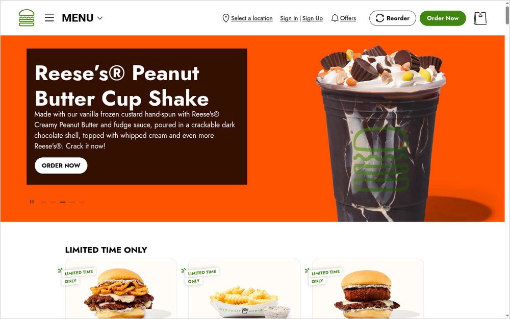
Shake Shack (shakeshack.com) serves people who already know what they want. Its site makes the repeat tasks easy: ordering, finding a location, and checking nutrition.
What it does well:
- "Our Menu" leads the navigation, with online ordering close behind.
- Nutrition and allergen information has its own page.
- Locations, catering, gift cards, and the Shack Store are easy to find.
- A help center and FAQs handle common questions without a phone call.
What to copy: think about what your regulars do most, then make those tasks one tap away. For most restaurants, that’s ordering, hours, and directions.
If your restaurant is part of a larger chain, nutrition info isn’t just helpful. The FDA’s menu labeling requirements apply to restaurants that are "part of a chain with 20 or more locations." This is general information, not legal advice.
Eleven Madison Park: reservations front and center
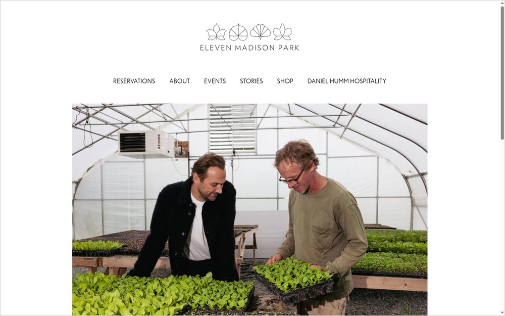
Eleven Madison Park (elevenmadisonpark.com) is a fine dining restaurant in New York, and its site is built around one action: booking a table. "Reservations" is the first item in the menu.
What it does well:
- A photo slideshow sets the mood before a word is read.
- A "Book on Resy" button sits right on the homepage.
- The address and phone number appear plainly on the homepage.
- Gift cards, events, and the team each have their own page.
What to copy: if most of your guests book ahead, make the reservation button the first thing they see. Then keep the address and phone visible for the people who want to call.
Noma: a brand that sells more than dinner
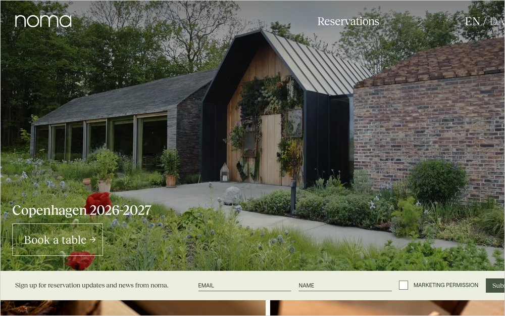
Noma (noma.dk) is a Copenhagen restaurant whose website sells a whole world around the dining room. Reservations sit next to a shop, recipes, and news.
What it does well:
- "Book a table" sits near the top, with a sign-up for reservation updates.
- A shop sells pantry products and a coffee subscription.
- Recipes, news, and a guide to building flavor give fans a reason to come back.
- English and Danish versions serve local and international guests.
What to copy: if guests love your food, give them more than a table. Gift cards, merchandise, or a newsletter keep the restaurant in their lives between visits.
Momofuku: many restaurants, one clear path
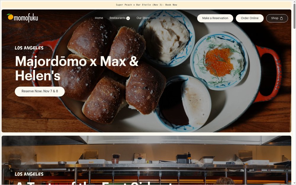
Momofuku (momofuku.com) runs restaurants in New York, Los Angeles, and Las Vegas under one site. Even so, each restaurant is easy to find.
What it does well:
- Every restaurant is listed with its full address.
- Each listing has its own "Make a Reservation" link.
- Restaurants can be filtered by state, so guests in Las Vegas see their options fast.
- Special events, like guest chef nights, appear near the top with booking links.
What to copy: if you have more than one location, give each its own listing with an address, hours, and a booking link. One shared phone number for every location frustrates guests.
| Website | Built for | Standout feature | Idea to borrow |
|---|---|---|---|
| Sweetgreen | Online ordering | Text menu with ingredients and allergens | Put the menu and ordering on the homepage |
| Shake Shack | Regulars | Nutrition, locations, and ordering one tap away | Make repeat tasks easy |
| Eleven Madison Park | Reservations | "Book on Resy" on the homepage | Lead with the booking button |
| Noma | Fans worldwide | Shop, recipes, and updates | Give guests more than a table |
| Momofuku | Multiple locations | Address and booking per restaurant | Give each location its own listing |
A restaurant website is a host stand. Greet them, then seat them.
Restaurant website features that do the quiet work
The examples above share a few website features that rarely get noticed but do a lot of selling. Restaurant owners can add most of them without a redesign.
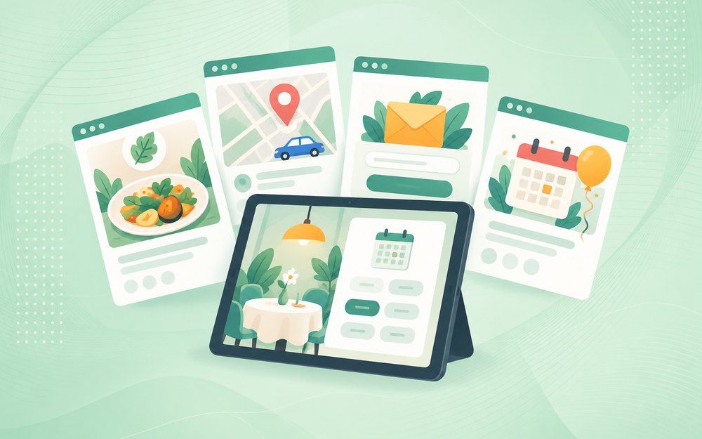
Specials and seasonal menus
A small "This week" section on the homepage gives regulars a reason to check back. Highlight a seasonal dish, a happy hour, or a holiday menu, and take it down when it ends. Stale specials send the wrong signal.
A short story with real faces
Guests like knowing who cooks their food. Two or three paragraphs about the chef, the owners, and what the kitchen cares about give a good restaurant a personality. A real photo of the team beats any stock image.
Booking and ordering that integrate cleanly
Most restaurants use a third-party tool for reservations or ordering. The best sites integrate it so the guest stays on your page, or opens the tool in one clear step. A button that leads to a confusing new site adds friction right at the decision.
Directions and parking
A map link, a line about parking, and a note on the nearest entrance save guests a stressful arrival. That’s especially true downtown, where parking shapes the whole evening.
A newsletter or text list
An email or text sign-up lets you announce new menus, events, and special nights to people who already like you. Keep the form to one field.
None of these needs a big budget. A well-built site gives them room, while a generic template tends to bury them.
Common mistakes on restaurant websites
The common failure isn’t looks. It’s making a hungry person work. Each mistake below is a place where a ready guest leaks away.

A PDF menu
PDF menus are the classic restaurant website mistake. They load slowly on a phone, force pinching and zooming, and often go out of date.
Google’s list of indexable file types shows it can read a PDF, but that doesn’t make one pleasant to use. Post the menu as text, and keep a PDF only as a printable extra.
Hours that don’t match
If your website says you close at 10 and your Google Business Profile says 9, someone will show up to a locked door. Update hours everywhere at once, including holiday hours.
Slow photo slideshows
Beautiful food photos sell, but huge images on a slideshow can stall a page on a phone. Google’s Core Web Vitals guidance says main content should load within 2.5 seconds for a good experience. Compress every image and limit the slideshow to a few frames.
Sending ordering to a third party only
Third-party delivery apps help people find you, but they also take a cut and keep the customer data. If you offer online ordering through your own website, make that the main button. Keep delivery apps as an option, not the default.
Auto-playing music and video
A video that starts on its own, especially with sound, is the fastest way to send someone back to the search results. Let visitors choose to play it.
Forgetting private events and catering
Group dinners and catering orders can be worth far more than a single table. Many restaurant sites leave them out or hide them in the footer. Give them their own page with a short inquiry form.
Now ask yourself: could someone on a sidewalk find your menu, hours, and booking button in under ten seconds?
How to apply these ideas to your restaurant website
You don’t need a famous chef’s budget to use these patterns. Start with the changes that help the most guests.
- Put hours, address, phone, and a booking or ordering button on the homepage.
- Replace any PDF menu with a text menu, and keep prices current.
- Add allergen notes where you can, so guests with allergies feel safe.
- Pick five to eight strong photos, compress them, and cut the rest.
- Add pages for private events, catering, and gift cards if you offer them.
- Test the whole site on your phone, from the homepage to a completed order.
Speed is where most restaurant website design goes wrong, and mobile website design and performance basics explains what slows a page down. Diners read reviews before they book, and how positive reviews affect local SEO shows why they help you show up in local results.
Once the site is live, keep it current. Menus, hours, and ordering tools change, and a website maintenance plan catches broken links and outdated pages before guests do.
Your menu is your best sales page. Make it easy to read.
Best restaurant websites FAQs
What should a restaurant website include?
A restaurant website should include your menu as text, your hours, address, and phone number, and a way to book a table or order online. Add a few high-quality food photos, a short story about the restaurant, and pages for private events, catering, or gift cards if you offer them.
How much does a restaurant website cost?
At White Peak, website prices start at $1,500, and most websites cost $3,000 to $10,000. A restaurant site’s price depends on the number of pages, menu setup, reservation and ordering integrations, and photography. Every site is custom, so the quote follows the scope.
Should a restaurant use a PDF menu?
A text menu is the better choice. It loads faster, reads well on a phone, and is easier to update. Search engines can read text menus clearly, too. Keep a PDF version only as an optional download for people who want to print it, and make sure both versions match.
Can I take online orders through my restaurant website?
Yes. Many reservation and ordering platforms connect to a restaurant website with a button or an embedded menu. Ordering through your own site lets you keep more control over the guest experience and customer data. Test the full order process on a phone before you promote it.
How do I get more customers from my restaurant website?
Make the menu, hours, and booking button easy to find, and keep them accurate. Show a few strong food photos and real reviews. Then help diners find you with a complete Google Business Profile, local SEO, and a site that loads fast on a phone.
Getting help in Reno
If you take one thing from this, build your restaurant website around the menu and the next step.
White Peak is a web design and digital marketing agency in downtown Reno. We build websites for restaurants and other local businesses in Reno, Sparks, Carson City, Truckee, and nationwide.
If you’re planning a new site for your restaurant, our web design in Reno team offers a free consultation to map out what your guests need.