
Quick Answer
The best dental websites make it easy to book. They show treatments, insurance, and payment options in plain language, and they load fast on a phone. Tend, Aspen Dental, Gentle Dental, and Western Dental each do this in a different way. The patterns are easy to copy, and none of them need a big budget.
Phones matter most: Google’s mobile-first indexing guide says it uses “the mobile version of a site’s content” for indexing and ranking.
A patient with a cracked molar at 9 p.m. is on the couch, phone in one hand, scrolling through dental websites. They don’t want your story yet. They want to know if you can see them, whether you take their insurance, and how to book.
The best dental websites answer those three questions before the patient has to look for them. Everything else on the site supports that moment.
What makes a dental website work
A dental website has one job above all others: turn a worried or curious visitor into a booked appointment. Design, photos, and copy all serve that job, or they get in the way.
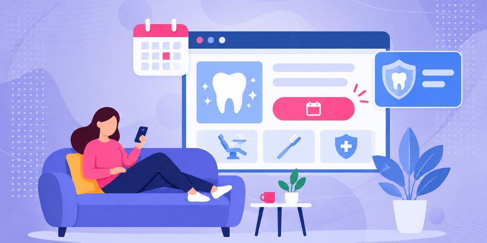
Here’s what the strongest dental practice websites have in common.
- A booking path on every page. "Book now" sits in the header, and it stays visible on a phone. Patients can book online or tap to call.
- Treatment pages in plain language. Each service has its own page that says what it is, who it’s for, and what happens at the visit. Separate service pages also give search engines something specific to rank.
- Insurance and payment up front. Accepted plans, financing, and new-patient offers are easy to find, with the fine print nearby.
- Proof from real patients. Reviews and photos of the actual office and team build trust with new patients in a way stock photos can’t.
- Speed and access. Pages load fast on a phone, text is readable, and forms work for every patient.
Think of the site as your front desk that never closes. A good front desk greets people, answers the common questions, and books the appointment. Your website should do the same. A weak one makes people wait, then they call the practice down the street.
Key Takeaways
The best dental websites share a few habits:
- Booking first: A visible “book” button on every page beats a contact form buried in the footer.
- Plain-language treatments: Each service gets its own page that answers what a patient would ask at the front desk.
- Costs in the open: Insurance, financing, and offers are easy to find, with honest fine print.
- Built for phones: Google indexes the mobile version first, so the site has to load fast and work with a thumb.
Examples of dental websites that get it right
These are real, live dental websites we’ve reviewed. We didn’t build them. We picked them to show patterns that any dental practice can copy. Most are group practices with bigger budgets, but the ideas scale down to a single office.
Tend: a calm brand that matches the visit
Tend (hellotend.com) sells a feeling as much as a service. The site’s message is "judgment-free" dental care, and the design backs that up with soft colors, open space, and short lines of copy.
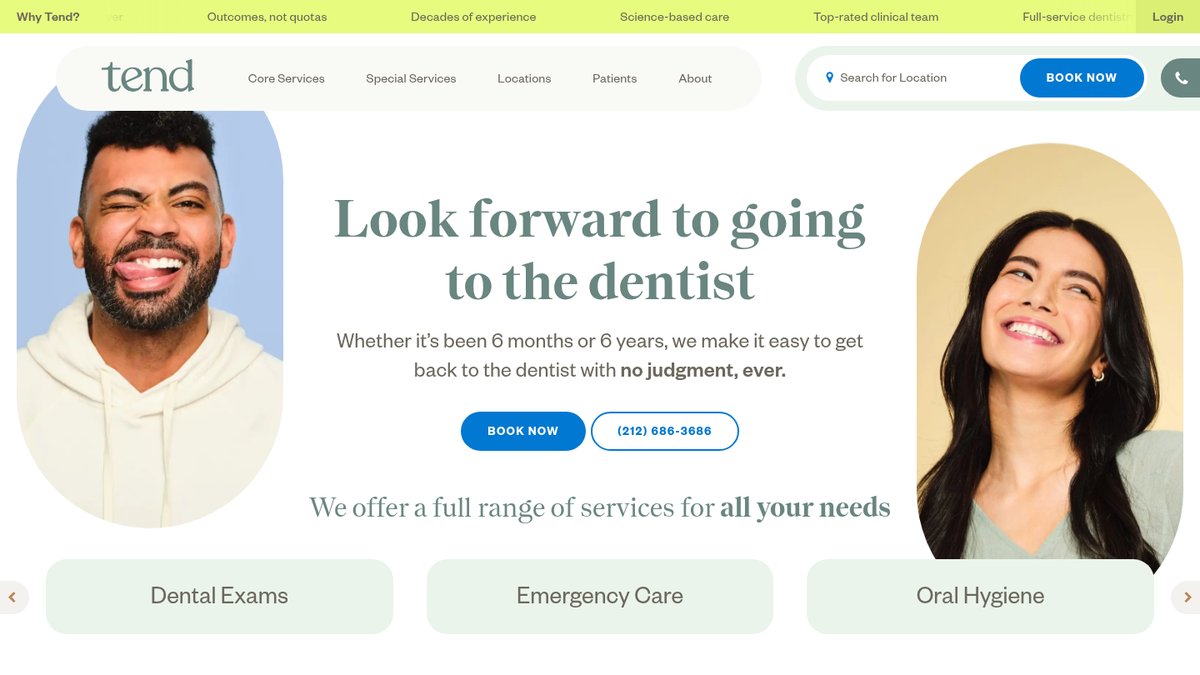
Tend’s home page (hellotend.com), captured November 2026.
What it does well:
- The menu splits services into core and special care, so patients find "Emergency" or "Invisalign" fast.
- "Book Now" sits in the main menu, with locations listed by city.
- Payment, insurance, and dental plans each get their own page under "Patients."
- The site offers an accessible version toggle at the very top of the page.
What to copy: decide how you want patients to feel, then make every page say it. If your practice is known for anxious patients, your site should feel quiet and reassuring, not loud.
Aspen Dental: booking built around the reason for the visit
Aspen Dental (aspendental.com) runs a large network, and its home page is built to get a patient booked fast. The first thing you see asks for your reason for visit and your location.
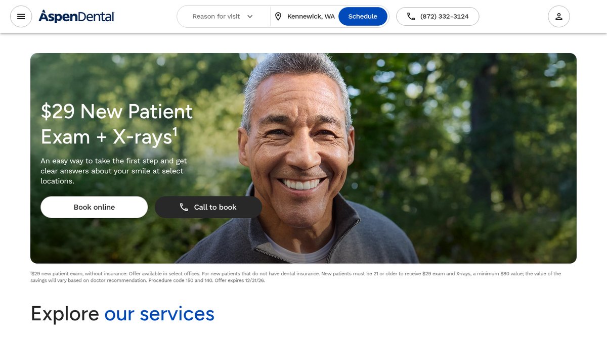
Aspen Dental’s home page (aspendental.com), captured November 2026.
What it does well:
- A "Reason for visit" menu sends patients down the right path, from dentures to emergencies.
- The nearest office appears automatically, with a phone number and a "Schedule" button.
- New-patient offers are clear, and the conditions sit right under them.
- Services like dentures, implants, and clear aligners each link to their own page.
What to copy: ask the patient what they need before you ask them to fill out a form. Even a small practice can add a simple "What brings you in?" choice to its booking page.
Gentle Dental: locations that are easy to scan
Gentle Dental of New England (gentledental.com) has offices across Massachusetts and New Hampshire. Its menu groups every location by region, so a patient in Quincy or Nashua finds the right office in a couple of taps.
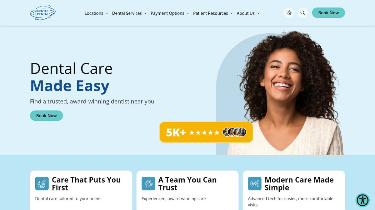
Gentle Dental’s home page (gentledental.com), captured November 2026.
What it does well:
- Locations are sorted by state and area, not dumped into one long list.
- A new-patient offer sits near the top, with what it includes spelled out.
- Services are grouped into cosmetic, emergency, oral surgery, orthodontics, and preventive care.
- "Book Now" shows up next to the offer, where the decision happens.
What to copy: if you have more than one office, give each its own page with its address, hours, and team. If you have one office, make the address, parking, and hours impossible to miss.
Western Dental: built for the patients it actually serves
Western Dental (westerndental.com) serves families across California and Arizona, and many of them use public dental plans. The site reflects that.
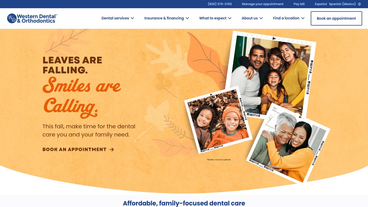
Western Dental’s home page (westerndental.com), captured November 2026.
What it does well:
- An "Español" switch sits in the header for Spanish-speaking patients.
- Medi-Cal, Medicaid, and Medicare Advantage each get a clear menu item.
- "Manage your appointment" and "Pay bill" are one tap away for existing patients.
- A "Dental anxiety" page and a "Your first visit" page answer fears before the patient calls.
What to copy: write for the patients you have. If many of your patients speak Spanish or use a certain plan, put that front and center. Don’t hide it in an FAQ.
| Website | Standout feature | Idea to borrow |
|---|---|---|
| Tend | Calm, judgment-free brand voice | Match the site’s tone to how the visit feels |
| Aspen Dental | Booking starts with "reason for visit" | Ask what the patient needs before the form |
| Gentle Dental | Locations grouped by region | Give each office its own clear page |
| Western Dental | Spanish switch and public-plan pages | Put your patients’ real needs in the menu |
A dental website isn’t a brochure. It’s the front desk that never closes.
The pages that do the quiet work
The examples above share a set of pages that rarely win design awards but do a lot of selling. Patients rarely land on them first. They find them while deciding.
A new patient page
A first visit page tells people what to bring, how long the appointment takes, and what happens in the chair. It lowers the friction of a first booking. Western Dental’s "Your first visit" page is a good model, and a single-office practice can write one in an afternoon.
Online forms and payments
Existing patients come back to the site too. They want to fill out forms before the visit, pay a bill, or move an appointment. Putting those tasks one tap from the header saves your front desk phone time and keeps patients happy between cleanings.
Team and office pages
People choose a dentist, not just a practice. A short bio, a real photo, and a line about what each dentist enjoys treating help a patient picture the visit. Add photos of the waiting room and parking so the first trip feels familiar.
Emergency care
An emergency page is the strongest signal of intent on a dental site. Someone reading it wants help today. Give it a clear phone number, your same-day policy, and what to do until they arrive.
Common mistakes on dental websites
Most dental practice websites don’t fail because they look dated. They fail because they make booking harder than it needs to be. Each mistake below is a place where patients leak away.
Hiding the booking button
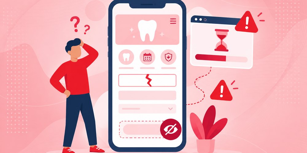
Some sites put booking on a single contact page, behind a long form. A patient with a toothache won’t hunt for it. Put a booking button in the header, keep it visible as the patient scrolls, and add a tap-to-call link for phones.
Writing service pages for dentists
Clinical dentistry terms belong in the chart, not the headline. A page called "Endodontic Therapy" helps fewer people than one called "Root canal treatment." Answer the questions patients ask at the front desk: does it hurt, how long does it take, and is it covered?
Burying insurance and costs
Patients want to know if you take their plan before they book. If that answer is hard to find, many will call someone else. List the plans you accept, explain financing, and keep any offer’s conditions right next to it.
Ignoring phones and page speed
Patients searching on a phone won’t wait long, and slow pages lose them. Google’s Core Web Vitals guidance says the main content should load within 2.5 seconds for a good experience. Big image sliders and auto-playing videos are common culprits on dental sites.
Leaving some patients out
Low-contrast text, missing image descriptions, and unlabeled form fields make a site hard to use for patients with disabilities. They’re also among the most common problems on the web. The WebAIM Million report found low-contrast text on 83.9% of home pages it tested. That’s a fixable problem on most sites.
Dental offices are businesses open to the public, and the ADA.gov web guidance explains how those businesses can make their websites accessible. This is general information, not legal advice. We recommend building accessible patterns in from the start.
Using stock photos of strangers
Patients want to see the real dental office, the real chair, and the real team. Stock photos of smiling models feel generic, and patients notice. A short photo session at your practice does more for trust than any template image.
Now ask yourself: if a new patient landed on your site tonight, how many taps would it take them to book?
How to apply these ideas to your practice website
You don’t need a group practice budget to use these patterns. Work through them in order, because each step builds on the one before.

- Put a booking button and phone link in the header of every page.
- List the treatments you want more of, and give each its own plain-language page.
- Add an insurance and payment page, and link to it from the booking path.
- Replace stock photos with real photos of your team and office.
- Add your best reviews near the booking buttons, where patients decide.
- Test the site on your own phone, then fix anything slow or hard to tap.
If you’re starting from scratch, dental website design built around booking makes every later step easier. If your current site is solid but slow, start with step six.
Reviews deserve extra attention. They help patients decide, and because of how positive reviews affect local SEO, they also help you show up in the map results.
Once the site is live, keep it healthy. Plugins, booking tools, and forms need updates, and a broken form can cost you patients for weeks before anyone notices. A website maintenance plan catches those problems early.
Copy the pattern, not the design. Your patients aren’t Aspen’s patients.
Best dental websites FAQs
What should a dental website include?
A dental website should include online booking or a clear phone link, a page for each main treatment, and your insurance and payment options. Add real photos of your office and team, patient reviews, your address and hours, and a new-patient page. Every page should work on a phone.
How much does a dental website cost?
At White Peak, website prices start at $1,500, and most websites cost $3,000 to $10,000. A dental site’s price depends on the number of treatment pages, booking integrations, and who writes the content. Every site is custom, so a real quote depends on what the site has to do.
Should a dental website have online booking?
Yes, usually. Online scheduling lets patients book appointments after hours, when many of them are browsing. It also removes a step for people who don’t like phone calls. Keep a tap-to-call option too, because patients in pain or with insurance questions often want to talk to a person first.
Do dental websites need to be accessible?
Accessibility helps every patient use your site, including people with low vision or who use screen readers. The ADA applies to businesses open to the public, and ADA.gov offers guidance on accessible websites. This is general information, not legal advice. Talk to a lawyer about your own legal obligations.
How do I get more patients from my dental website?
Make online booking easy from every page, write treatment pages in plain language, and show real reviews near your booking buttons. Then make sure patients can find you at all. Local SEO, a complete Google Business Profile, and fast mobile pages all help new patients reach your site.
Getting help in Reno
If you take one thing from this, build your dental website around the booking, not the brochure.
White Peak is a web design and digital marketing agency in downtown Reno. We build websites for dental practices and other local businesses in Reno, Sparks, Carson City, Truckee, and nationwide.
If you want web design in Reno that turns visits into appointments, book a free consultation and we’ll map out what your site needs.