
Key Takeaways
Accounting firms can make their first screen build more confidence by:
- Lead With Client Fit: Show who the firm helps and the specific problem it understands.
- Use Relevant Proof: Choose specific, believable evidence tied closely to the visitor’s needs.
- Show Real People: Favor authentic team or client context over generic stock photography.
- Match the CTA: Ask for a next step that fits the level of trust the page has already earned.
Check out our web design services for accounting and CPA firms.
Most accounting firm above-the-fold sections are trying to look credible.
Credible is not the same thing as confidence-building.
A cautious prospect doesn’t land on an accounting firm website thinking, “I hope this firm has a photo of downtown Los Angeles.” They’re usually thinking something closer to this: “Can these people handle my tax problem without making a mess of it?”
That fear of incompetence lies beneath much of the behavior on accounting websites. The visitor may need tax prep, bookkeeping, advisory support, IRS relief, compliance work, wealth reporting, or help with software and financial records. Whatever brought them there, the stake feels personal. A missed deadline, a bad return, a sloppy file, or a weak accountant can create real pain.
So when the first things they see are a stock image of people shaking hands, a vague headline, and a massive list of services, the page isn’t reducing risk. It’s asking the visitor to do the work.
And that’s where many CPA firm websites lose people.
The First Screen Has One Job: Make the Visitor Feel Safer
Above the fold doesn’t mean “the homepage hero.” It means the first screen someone sees when they land on any page.
That could be a homepage. It could be a tax service page. It could be a niche advisory page for business owners. It could be a multi-page location section built for SEO traffic. The page type matters less than the first impression.
The visitor needs to know a few things quickly:
- Am I in the right place?
- Does this firm understand my problem?
- Have they helped clients like me?
- What proof can I trust?
- What’s the safest next step?
If the page answers those questions, the visitor will usually keep reading. If it doesn’t, they may bounce even if the firm’s qualified.
Here is the frustrating part. A professional accounting firm can have a strong team, reliable preparation workflows, a real track record, and a good customer experience, then still lose a prospect because the first screen looks like every other firm in the category.
What Accounting Firms Put Above the Fold Instead
There is a pattern you see again and again on accounting firm sites.
Stock images of people in suits. Generic local landmark photos. “Established in 1987.” A broad headline about accounting, tax, and advisory services. A list of service categories long enough to make a busy owner feel like they just opened the firm’s internal filing cabinet.
None of those things are automatically wrong. They’re just weak signals.
The date a firm was established may matter. A corporate building may suggest permanence. A local skyline may help a location page organize itself for search. A badge may show a credential. A service list may help someone navigate.
But none of those elements, by themselves, tell the prospect how well they’ll be cared for.
Look at the difference between these two lines:
- Accounting, tax, and advisory services in Los Angeles
- We help mid-sized manufacturers navigate multi-state tax compliance
The first line is a category label. The second line starts to reduce risk.
That distinction matters because the visitor isn’t shopping for “accounting” in the abstract. They’re trying to select a firm that can handle their specific situation. A generic headline makes the prospect wonder whether every CPA firm says the same thing because none of them has anything specific to say.
Four Above-the-Fold Examples Worth Learning From

Several of the accounting firm examples we reviewed had a similar problem: the first screen looked polished or search-friendly, but it didn’t give the cautious prospect enough reason to trust the page.
These examples aren’t a judgment on the quality of the firms. They’re a look at what the first screen’s asking the visitor to believe before the page has earned that confidence.
Cherry Bekaert: a location page that leads with category, not confidence
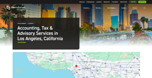
Cherry Bekaert’s Los Angeles page is polished, but the first screen mostly says, “We provide accounting, tax, and advisory services in Los Angeles.” That may help the page organize itself for local SEO, but it doesn’t speak to the prospect’s real concern.
A cautious visitor isn’t wondering whether Los Angeles exists or whether the firm offers a broad range of services. They’re wondering whether this accounting firm understands their situation and can reduce the risk of choosing poorly. The city image, broad category language, and map-like location framing don’t answer that. The page wins visibility, then asks the visitor to keep searching for the reason to trust it.
Windes: a building photo is not the same as proof
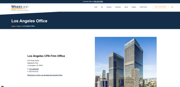
The Windes example has a similar problem. The first screen emphasizes the Los Angeles office and pairs the location copy with a large building photo. That can make the firm look established, but a building doesn’t tell a prospect how well their tax issue, bookkeeping problem, or advisory need will be handled.
This is where many professional firms confuse permanence with proof. A big office can suggest stability, but it doesn’t show results, care, niche experience, or client fit. If the headline’s essentially a local keyword and the strongest visual’s the building, the visitor still has to supply the confidence themselves.
Stenger Tax Advisory: keyword-heavy copy asks for the meeting too soon
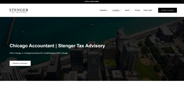
Stenger Tax Advisory’s first screen leans into local keyword phrases such as “Chicago Accountant,” “Chicago Accounting Firm,” and “Small Business CPA in Chicago.” The page is clear about the market it wants to rank in, but it doesn’t do much to reduce the visitor’s fear of incompetence.
The call to action asks for a scheduled consultation before the page has shown much specific proof, human presence, or client-fit context. That’s a hard ask. A visitor who’s worried about an IRS issue, a tax prep mistake, a compliance deadline, or a messy file may need more reassurance before booking. The page should make the prospect feel understood first, then ask for the next step.
Mowery & Schoenfeld: polished, but too generic to de-risk the choice
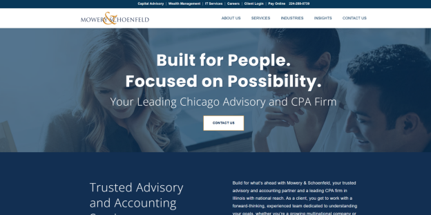
Mowery & Schoenfeld’s first screen uses a professional-looking image of people and the headline “Built for People. Focused on Possibility.” The problem is not that the line sounds bad. The problem is that it could belong to almost any professional services company.
A shipping company, a consulting firm, a software vendor, or a landscaper could all say something similar. That makes the line feel safe, but not useful. The visitor still doesn’t know which accounting problem the firm’s best at solving, which clients it’s built for, or what proof should make them feel comfortable. Paired with a generic “Contact Us” CTA, the page asks for action before it’s built enough confidence.
For the location-heavy examples, the issue is not that local keywords are bad. SEO matters. The issue is when local keywords become the whole first impression.
If a visitor sees mostly location, service category, and a stock or building image, the page hasn’t done much to answer the real question: “Why should I trust this firm with my situation?”
That’s especially true for accounting and tax work. People aren’t hiring a restaurant or a gym. They may be handing over sensitive financial information, IRS notices, records from a messy bookkeeping system, or a reporting problem that’s already created panic. A location keyword doesn’t make that feel safer.
The page still needs to convert.
This isn’t only a busy tax season problem, either. In plenty of firms, the year’s dictated by the same marathon: tax season ends, returns are filed, extensions are submitted, 1040s are filed, compliance work ships, and the team finally exhales. Then something predictable happens for firms with weak first screens: emails stop, calls dry up, and the website slips into hibernation mode. That’s a marketing and operations problem, not a reason to stuff more city keywords into the hero.
Stock Photos Make the Firm Feel Less Real
The quickest way to make an accounting website feel generic is to use a photo that looks like it came from a library of “professional people smiling near a laptop.”
Visitors can usually tell.
The point isn’t that a page can never use a polished people photo. The problem’s when the image is doing the work that the copy and proof should be doing. If the visitor can’t tell who the firm helps, what problem it solves, or why the team’s credible, the photo’s just decoration.
Real human faces do something that stock photography can’t. They help the visitor feel that there’re actual accounting professionals behind the page. That doesn’t mean every page needs a giant staff photo above the fold. But if you’re going to use people, use real people.
The same principle applies to testimonials. A quote with a name, role, company type, or client context is usually stronger than a floating sentence with no face and no detail. A testimonial from a business owner in the visitor’s industry can reduce friction faster than a generic “great service” quote from an unnamed client.
Specificity makes proof feel earned.
Strong Proof Is Relevant, Measurable, and Close to the Visitor’s Problem
Not every proof point belongs above the fold.
A line like “$42 million in R&D tax credits claimed for clients” can be powerful on a page for manufacturers, software companies, or technical founders. It doesn’t belong on a page for personal tax return preparation. The proof may be impressive, but it isn’t relevant to the visitor’s immediate need.
That is the test worth using.
Good above-the-fold proof should be:
- Relevant to the visitor’s problem
- Specific enough to be believable
- Measurable when possible
- Close to the service or niche on the page
- Easy to read without slowing the visitor down
Some proof is hard proof: tax savings, credits claimed, returns prepared, compliance deadlines met, audits resolved, reporting systems cleaned up, or advisory outcomes tied to real business decisions.
Some proof is human proof: a testimonial with a face, a named client type, or a quote that sounds like an actual person said it.
Some proof is fit: “we work with medical practices,” “we help construction companies,” “we support entrepreneurs using cloud accounting software,” or “we guide families with global income and assets.”
Some proof is operational: the firm helps a business owner organize records, navigate regulatory change, keep front-line accounting questions moving, and grow without adding more internal finance work. For the right prospect, that can be more persuasive than a logo strip from industry newsletters.
Credential badges and professional memberships can help, but they’re usually not enough on their own. Most CPAs can show credentials. Fewer can show a prospect, above the fold, that the firm understands their exact accounting problem and has helped someone like them before.
Medium proof is still better than no proof. A reliable testimonial beats an empty hero. A clear niche statement beats a vague slogan. A real team photo beats a stock handshake. But the closer the proof gets to the visitor’s concern, the harder it works.
Kingston Tax Advisors Shows Why Specificity Feels Different
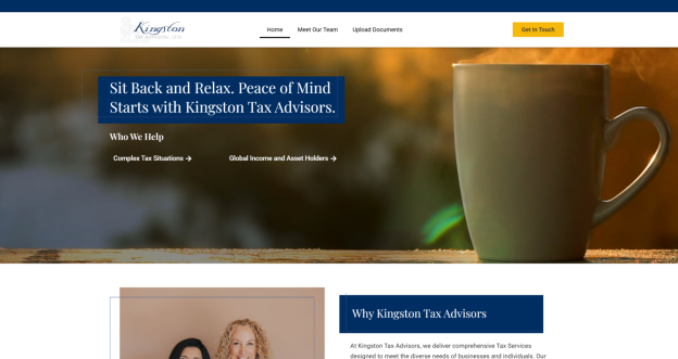
Kingston Tax Advisors is a useful positive example because the page doesn’t try to impress everyone in the first three seconds.
The headline says, “Sit Back and Relax. Peace of Mind Starts with Kingston Tax Advisors.” On its own, that could sound soft. But in context, it works because the page is aimed at people with complex tax situations and global income and assets. Those visitors aren’t merely looking for someone to file a return. They’re overwhelmed. They want peace of mind because they’re dealing with a firm that’ll take away their stress.
The page also lets visitors self-select into paths such as complex tax situations or global income and asset holders. That matters. It tells the visitor, “This firm works with someone like me.”
Then, just below the hero, actual team members begin to appear, and the next section answers the question most prospects are already asking: “Why Kingston Tax Advisors?”
That flow is doing real work. It reduces risk. It shows audience fit. It gives the visitor a safe way to keep moving without feeling shoved into a generic contact form.
The CTA, “Get in Touch,” isn’t perfect for every accounting firm, but on this page it doesn’t feel as abrupt as a cold “Contact Us” button because the first screen’s already done more to make the visitor feel understood.
That’s the real lesson. A CTA’s only as strong as the confidence built before it.
The CTA Has to Match the Confidence Already Earned
Many accounting firm websites ask for too much confidence too soon.
“Schedule Consultation” can be a good CTA when the page has already shown fit, proof, and a clear reason to talk. But if the first screen’s vague, asking for a consultation can feel like a commitment the visitor isn’t ready to make.
Sometimes the safer next step is smaller:
- Request a 15-minute tax diagnostic session
- Get a second look at your compliance concern
- Ask about advisory support for your industry
- See if we’re a fit for your tax situation
- Talk with a CPA about your next deadline
Those CTAs don’t pretend the visitor’s ready to buy. They let the visitor test the relationship.
That’s especially useful when the page deals with sensitive work. A prospect who’s worried about an IRS notice, messy bookkeeping, a late file, a tax deadline, or a complicated advisory decision may need a discovery step before booking a full consultation.
The first screen should earn the ask.
A Better Above-the-Fold Checklist for Accounting Firms

When we look at an accounting firm website, we are not asking whether the first screen looks expensive. We are asking whether it lowers the right kind of anxiety.
A stronger above-the-fold section usually includes:
- A headline tied to a real client problem
- A subhead that explains who the firm helps and how
- A proof point that matches the page’s audience
- Real faces or a human signal from the firm
- A CTA that feels safe for the visitor’s level of readiness
- Enough navigation clarity that the visitor can keep moving
It usually avoids:
- Stock photos that look fake or clinical
- Local landmark photos used as proof
- Huge service lists that create decision fatigue
- Vague headlines that could fit any professional service firm
- Established dates treated as the main credibility signal
- CTAs that ask for commitment before the page has earned trust
Don’t cram every proof element into the first screen. That just creates clutter. Select the proof that does the most risk-reduction work for that page.
A tax prep page needs different proof than an advisory page. A page for entrepreneurs needs different proof than a page for established wealth clients. A bookkeeping page needs different proof than a page about navigating regulatory change. Every CPA firm should have a consistent strategy, but every page should still respect the visitor’s situation.
FAQs About Accounting Firm Above-the-Fold Proof
What should an accounting firm show above the fold?
An accounting firm should show a problem-focused headline, clear audience fit, relevant proof, real human cues, and a safe next step. The page should help the visitor confirm they are in the right place before requesting a consultation.
Are credentials enough above the fold?
Credentials help, but they rarely do the whole job. Many CPAs and accounting professionals have credentials. Stronger proof shows how the firm helps a specific client, niche, or service need.
It also helps when the page outlines the firm’s onboarding process for new clients, at least in a sentence or two. A visitor shouldn’t have to guess what happens after they click.
Should accounting firms use local keywords above the fold?
Local SEO language can help search visibility, but it shouldn’t crowd out client-focused proof. A page can mention location while still speaking to the prospect’s problem, risk, and desired outcome.
Should accounting firms use stock photos?
Usually no. Stock photos often make the page feel less authentic. Real team photos, client-context proof, and specific service language usually build more confidence.
What makes above-the-fold proof stronger?
The best proof is specific, relevant, and verifiable. Quantifiable outcomes, niche-specific testimonials, recognizable client situations, and real team presence usually carry more weight than vague claims or generic badges.
Make the First Screen Earn the Scroll
The first screen doesn’t need to explain the whole firm.
It needs to make the visitor feel safe enough to keep going.
That’s a higher bar than looking professional. A page can look polished and still feel empty. It can use a clean layout, a strong font, a polished photo, and a neat CTA while saying almost nothing that helps the prospect choose.
For an accounting firm, the above-the-fold section should tell the visitor what they are getting, how the firm can help, whether the firm works with someone like them, and what safe next step makes sense.
That same proof must remain visible and usable on a phone. Our guide to mobile UX problems that stop tax clients from taking action explains how first-screen proof, calls, forms, and sticky elements can break down on smaller screens.
That’s how the first screen begins to earn trust rather than simply occupying space.
White Peak builds websites for CPAs and accountants around that kind of first impression. If your accounting firm website looks credible but does not make cautious prospects feel confident, we can help sharpen the message, proof, and conversion path.