Key Takeaways
Accounting firms can make advisory expertise easier for prospective clients to trust by:
- Show the Thinking: Use client-safe scenarios to reveal how the firm diagnoses and solves problems.
- Add Specificity: Describe real operating contexts without exposing confidential client identities.
- Make Work Visible: Use redacted deliverables and measurable outcomes to demonstrate practical value.
- Lead With Decisions: Frame advisory around the business questions clients need help answering.
Check out our website design services for CPAs and accounting firms.
Most accounting firm advisory pages have a trust problem.
Not because the firm lacks expertise.
Usually, the problem is that the page doesn’t show the expertise in a way a stressed business owner can recognize. It says “strategic advisory.” It says “CFO-level guidance.” It says “growth partner.” Maybe it adds a CPA license, a software badge, a few polished headshots, and a button to schedule a call.
That may feel professional from inside the firm.
From the buyer’s side, it can feel thin.
Advisory isn’t tax prep. The buyer isn’t only asking, “Can this accounting firm file my return?” They’re asking whether this firm can help them make decisions that affect cash flow, hiring, pricing, margins, payroll, growth, and risk.
That is a much bigger ask.
So the page needs stronger proof. Not louder proof. Not a giant wall of testimonials. Stronger proof.
This is where advisory case studies can help, even when you can’t publish a named client story. A good advisory page can borrow the shape of a case study without exposing confidential details. It can show the problem, the context, the firm’s thinking, the decision points, the work product, and the practical outcome.
In other words, it can let the prospect see how you think.
“If you cannot show the client name, you can still show how your firm thinks.”
~Tim Woda, White Peak Marketing, SEO & Web Design
That is the heart of the whole article.
Credentials Are Not the Same Thing as Advisory Proof
Accounting firms often try to prove advisory expertise with internal credentials.
There is nothing wrong with credentials—a CPA license matters. Professional designations matter. Software certifications can matter. If your team knows the tools, the systems, and the rules, that’s part of the story.
But it’s not the whole story.
The mistake is treating credentials as if they automatically prove client-facing competence.
A QuickBooks badge may show that an accountant understands accounting software. It doesn’t prove that the firm knows how to help a business owner improve profit margin, decide when to hire, avoid a cash flow crunch, or prepare for market entry into new markets.
Software mastery isn’t the same as business intuition.
If an advisory page shows only badges, certifications, and a broad list of services, it asks the visitor to leap. The visitor has to assume the firm can translate financial data into better business decisions.
That is a big assumption.
The page should make the leap smaller.
Instead of saying:
“We provide strategic advisory services to maximize your potential.”
Say something closer to:
“We help you calculate when you can afford your next hire, how to price a new product line, and how to bridge a 30-day cash flow gap before it turns into a payroll problem.”
That’s still advisory. It’s just advisory written in the language of the business problem.
The Advisory Page Should Prove Thinking, Not Just Experience
The best accounting firm website doesn’t ask the reader to trust a claim without showing the underlying logic.
That is especially true for advisory pages.
If the page says “construction CPA,” the buyer still needs to see more. Do you understand change orders? Job costing? Bonding capacity? Labor overruns? Delayed receivables? The phrase alone doesn’t prove much.
If the page says “SaaS advisory,” the buyer still needs to know whether you understand ARR, churn, runway, pricing tiers, customer acquisition costs, or investor reporting.
This is where case-study-style proof works better than a generic claim.
You don’t have to name the client. You don’t have to publish confidential numbers. You don’t have to pretend the page is a full formal case library.
You can show enough of the thinking process to make the expertise believable.
For example:
That kind of example does more than say, “We help SaaS companies grow.”
It lets the reader watch the firm think.
Client-Safe Proof Still Needs Specificity
When a firm can’t publish a named client case study, the usual fallback is a fake-feeling pseudonym.
“A local business.”
“A growing company.”
“A technology client.”
Those phrases are safe, but they’re also forgettable. They don’t build much trust because they don’t sound like a real operating environment.
The better move is to replace the client name with a specific operational context.
Instead of “a construction client,” say:
“A multi-state commercial framing subcontractor managing six concurrent job sites and $12 million in annual bonding capacity.”
Instead of “a tech startup,” say:
“A venture-backed SaaS company scaling from $2 million to $8 million ARR with a 14-person remote team.”
That kind of detail doesn’t reveal the client. It reveals the complexity.
And that is what the reader needs.
“Specificity creates authenticity.”
~Tim Woda, White Peak Marketing, SEO & Web Design
If the prospect sees their own pressure in the example, the advisory page starts to feel real. The case studies don’t need to name-drop. They need to make the business problem recognizable.
What a Client-Safe Advisory Proof Block Can Include
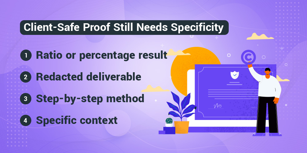
There are several ways to make advisory work visible without exposing private client details.
Some are written. Some are visual. The best advisory pages often use a mix.
Here is a practical way to think about it:
|
Proof type |
What it shows |
Why it works |
|
Specific context |
The kind of business and situation involved |
Helps the right buyer recognize themselves |
|
Redacted deliverable |
A dashboard, tax roadmap, forecast or planning tool |
Turns advisory from a conversation into a concrete asset |
|
Step-by-step method |
The symptom, diagnosis and prescription |
Shows how the firm investigates the problem |
|
Ratio or percentage result |
Improvement without confidential raw numbers |
Proves impact while protecting sensitive details |
The surrounding copy still has to explain the proof. The table is just a quick way to see the options.
A redacted deliverable can be especially powerful because advisory often feels invisible. A prospect may wonder, “Am I paying for a useful system, or am I paying for expensive conversations?”
Show the artifact.
That might be a safely redacted cash-flow forecasting dashboard, a 12-month tax-strategy roadmap, a pricing model, an ERP readiness checklist, or a capital-markets reporting snapshot. Blur the names. Remove the logo. Round the numbers. Use representative placeholders when needed.
The point isn’t to expose the client.
The point is to prove that your advisory work produces something a business owner can use.
Show the Symptom, Then the Diagnosis
One of the best ways to make advisory expertise credible is to show the detective work. behind it
Do not jump straight from “problem” to “result.”
That can feel too clean.
Instead, show the chain of reasoning.
For example:
- Symptom: The client’s P&L showed healthy top-line growth, but cash reserves were shrinking every month.
- Diagnosis: The firm reviewed job-costing data and found that change orders were underpriced by 14%, leaving field labor unbilled.
- Prescription: The firm built a change-order calculator for project managers and tied it to the billing cycle.
This doesn’t require naming the client.
It does require explaining how the firm thinks.
That is the difference between a claim and proof. A claim says, “We help businesses improve cash flow.” Proof says, “Here is the signal we saw, here is what it meant, and here is what we changed.”
The second version feels more believable because it respects the reader’s intelligence.
It also makes the advisory process less mysterious.
Use Outcomes Without Overexposing the Client
Many accounting firms avoid advisory case studies because they assume the only useful result is a specific dollar amount tied to a named company.
That’s not true.
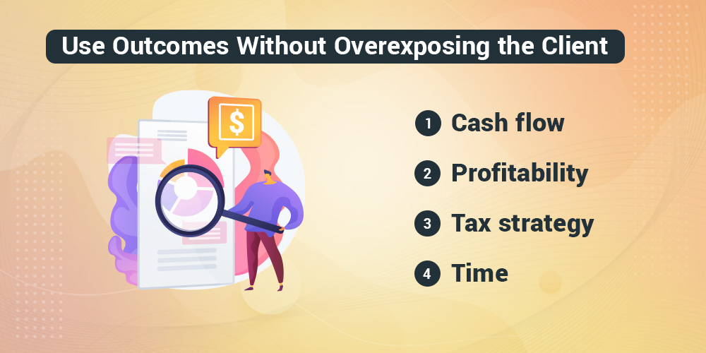
You can often use percentages, ratios, timing improvements, or time saved.
For example:
- Cash flow: Unlocked 22 days of accounts receivable lag and brought cash into the business three weeks faster.
- Profitability: Increased gross margin by 6.4% across the core product line within 90 days.
- Tax strategy: Reduced the owner’s effective state tax rate by 18% through a multi-state entity restructure.
- Time: Cut the executive team’s monthly financial review from six hours to a 20-minute dashboard sign-off.
Those aren’t vague results. They’re concrete enough to build confidence.
They’re also safer than dumping raw financial information onto a public page.
Of course, the firm still needs permission and internal review before publishing anything that could identify a client. This is not legal confidentiality advice. It is a content principle: if the exact name or exact number is sensitive, look for the client-safe version of the proof.
Build the Page Around Decisions, Not Tasks
Most weak advisory pages are organized around inputs.
Variance analysis.
KPI tracking.
General ledger oversight.
Financial modeling.
Monthly reporting.
Those may be part of the work, but they are not the reason a business owner reaches out.
The owner wants better decisions.
So the page should be built around the questions the firm helps answer.
Instead of a section called “Financial Modeling,” try:
“Can we afford the next three hires?”
Instead of “Margin Optimization,” try:
“Which services are actually making us money?”
Instead of “Cash Flow Advisory,” try:
“Why are sales up while cash keeps disappearing?“
The work underneath can still involve reporting, software, dashboards, and analysis. But the page should lead with the decision, not the accounting input.
That shift matters because advisory is a trust-heavy service. A prospect doesn’t want to decode your internal workflow. They want to know whether you can help them make a decision they’re nervous about.
The Page Has to Handle Shame and Time Friction
This is one of the places where most web design agencies often miss the mark.
They treat accounting advisory pages like standard B2B SaaS or corporate consulting pages. Everything gets sleek, abstract, and polished. The copy says things like “streamline your financial ecosystem with elegant data integration.” The visuals show chess pieces, compasses, glass conference rooms, lighthouses, or other strategy metaphors.
It may look expensive.
It may also make the buyer feel worse.
Business owners seeking advisory help often feel embarrassed. Their books may be messy. They may be behind. They may not fully understand the numbers. They may worry that a professional accountant will judge them.
If the page feels too sterile, it can create distance.
The fix isn’t to make the page sloppy. The fix is to make it human.
Say the quiet part out loud:
“You don’t need perfect books before we talk. If your financials are behind, messy, or hard to explain, that’s exactly where we can help.”
That sentence can do more for conversion than another abstract graphic.
The page also has to deal with time friction. A business owner might look at a six-step advisory process and think, “This looks like a second full-time job.”
So make the time investment visible:
“We handle 95% of the heavy lifting. Your role is one 45-minute monthly alignment call and a secure portal upload.”
That’s not just process copy. It’s risk reduction.
Where Advisory Proof Should Live on the Page
Proof placement matters.
If the proof appears too late, the reader may never reach it. If it appears without context, it may feel like decoration. If it is too generic, it may not reduce the specific doubt the reader has at that moment.
Use proof where the anxiety appears.
|
Page moment |
Buyer doubt |
Proof that helps |
|
Hero section |
Does this firm understand my situation? |
Specific niche context or macro result |
|
Decision-focused section |
Can they help with my actual problem? |
Three-line advisory scenario |
|
Process section |
What will this require from me? |
Time-investment explanation and team details |
|
Deliverable section |
Is advisory just vague conversation? |
Redacted dashboard, roadmap or forecast |
|
CTA section |
Is it safe to reach out? |
Mini case study and low-pressure next step |
That last line matters.
Right before a call to action, the buyer’s anxiety often spikes. They start wondering how much work it will be, whether they will be judged, whether the firm will hard sell them, and whether the conversation will be worth the time.
Put confidence there.
Not pressure.
This is where advisory proof connects back to the broader page strategy. Your above-the-fold proof earns the first few seconds of trust, your service page layouts help the reader understand where advisory fits, and your pricing, process, and fit language make the next step feel less risky.
Real People Matter More Than Corporate Polish
Advisory work is intimate.
The firm isn’t just touching tax returns. It’s touching decisions, cash, staff, pricing, ownership, and future plans.
That is why anonymous corporate messaging feels out of place on advisory pages.
If the visitor suspects the work will disappear into a black box, trust drops.
Show the actual people who lead the strategy. Use real headshots. Add brief, personality-driven bios that explain the advisor’s commercial background, not just their title. If a partner has worked deeply with construction companies, SaaS operators, medical practices, manufacturers, or public sector contractors, say that.
The goal isn’t to make the page about the firm.
The goal is to make the expertise feel attached to real human beings.
That is also why an advisory page shouldn’t hide behind generic stock photos of people in suits around a conference table. A cautious buyer is trying to decide whether to trust you with sensitive financial information. Real faces help.
A Useful Advisory Page Framework
If you want a simple framework for advisory pages, use this:
- Name the specific business friction.
- Show the kind of company or owner the service is built for.
- Explain the decision the firm helps improve.
- Show the signal or metric the firm watches.
- Walk through a client-safe example.
- Show the deliverable or work product.
- Explain the client’s time commitment.
- Introduce the real advisory team.
- Offer a low-pressure next step.
That framework isn’t a generic case-study template. It’s a trust-building structure for advisory pages.
It works because it moves from fear to clarity.
The reader starts with a vague sense that something in the business isn’t working. The page helps them see the problem, understand what the firm looks at, trust the firm’s judgment, and take one safe step forward.
FAQs About Advisory Case Studies
What are advisory case studies for accounting firms?
Advisory case studies show how an accounting firm helps clients make better business decisions. They can include the client’s context, problem, decision points, advisory approach, deliverable, and practical outcome.
Can advisory case studies work without naming the client?
Yes. A firm can use anonymized scenarios, specific operational context, redacted deliverables, percentage improvements, ratios, and step-by-step methodology to make the story credible without naming the client.
What should accounting firms avoid on advisory pages?
Avoid vague buzzwords, software badges as the main proof, laundry lists of compliance tasks, abstract strategy imagery, and process sections that make advisory look like a huge time burden for the client.
Where should advisory proof appear on the page?
Position proof right beside the doubt it addresses. For specific instances, use targeted proof near the hero section, include service-specific scenarios where decisions are made, place redacted deliverables close to the process copy, and add mini case studies next to the call to action.
How are advisory case studies different from consulting case interviews?
Consulting case interviews test a candidate’s problem-solving under interview conditions. Advisory case studies on an accounting firm website build buyer trust by showing how the firm thinks through real client problems.
Make the Expertise Visible
Advisory pages don’t need to reveal everything.
They do need to reveal enough.
Enough context for the right buyer to recognize themselves. Enough process to prove the firm isn’t guessing. Enough outcome to show that the work leads somewhere. Enough humanity to make the first conversation feel safe.
That is the real job of case-study-style advisory content.
It turns advisory from a vague promise into visible judgment.
White Peak builds websites for CPAs and accountants with that kind of proof structure in mind. If your advisory pages undersell your expertise, we can help turn your process into clearer proof that builds trust before the first conversation.