Quick Answer
The best church websites welcome a first-time visitor in seconds. They show service times and location up front, make sermons easy to watch, and offer a clear first step for newcomers. Elevation Church, Saddleback, North Point, and Redeemer each do this well. Online giving, events, and kids’ ministry info round it out.
Online visits matter: Pew Research Center found “about a quarter of U.S. adults regularly watch religious services online.”
Plenty of people find a new church on a phone, alone, before anyone at the church knows they exist. Your website is the first greeter they meet.
The best church websites act like a good greeter. They smile, answer the obvious questions, and point the way to the door. Then they get out of the way.
What makes a church website work
A church website serves two groups at once. Newcomers want to know what to expect. Church members want sermons, events, groups, and a way to give. The best sites serve both without making either dig.

Here’s what the strongest church websites share.
- Service times and location above the fold. A visitor shouldn’t scroll to learn when and where to show up.
- A clear "I’m new" path. One page that covers what to wear, how long the service runs, parking, and kids’ check-in.
- Sermons that are easy to watch. The latest message is one tap from the home page, with a live stream if you offer one.
- Simple online giving. A visible "Give" link and a short form, with one-time and recurring options.
- Ways to connect. Groups, serving teams, and events that help a visitor become part of the congregation.
That’s the whole job: help a stranger take one step closer. A church website builder can get you a page online, but structure and words decide whether anyone walks through the door.
Key Takeaways
The best church websites share a few habits:
- Answer the visitor first: Service times, location, and what to expect sit at the top of the home page.
- One next step: Each page points to a single action, like planning a visit or joining a group.
- Sermons within reach: The latest message is one tap away for members and curious visitors alike.
- Giving made easy: A short, secure giving form with recurring options supports the ministry all year.
Church website examples worth learning from
These are real, live church websites we’ve reviewed. We didn’t build them. Most belong to large churches, but every pattern below works for a small congregation as well as a large one.
Elevation Church: many ways to show up
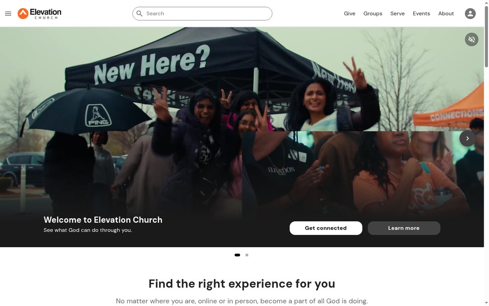
Elevation Church (elevationchurch.org) meets people wherever they are. Its home page lays out several ways to attend, each with its own button.
What it does well:
- "Get connected" and "Watch the latest sermon" are the first two actions on the page.
- Physical campuses, live streams, watch parties, and pop-up services each get a clear explanation.
- Give, Groups, Serve, and Events sit in a short top menu.
- Current events, like a young adults night, appear with a clear call to RSVP.
What to copy: name every way someone can take part, then give each a button. If you stream your service, treat online viewers as part of the congregation, not an afterthought.
Saddleback Church: first steps in the visitor’s own words
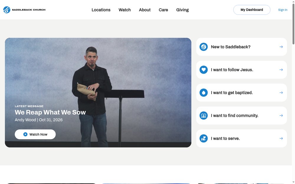
Saddleback Church (saddleback.com) has a section called "New to Saddleback?" that lists next steps as plain sentences. Visitors choose from lines like "I want to find community" or "I want to serve."
What it does well:
- The latest message, with the speaker and date, sits at the top of the page.
- First steps are written the way a visitor would say them, not as ministry names.
- A one-hour "Activate" experience gives newcomers a low-pressure starting point.
- Locations, online community, and the church app are easy to find.
What to copy: write your next steps in the visitor’s voice. "I want to get baptized" is clearer than a ministry name a guest has never heard.
North Point Community Church: service times you can’t miss
North Point Community Church (northpoint.org) puts the basics first. Sunday service times appear near the top of the home page, along with when the on-demand message goes live.

What it does well:
- "I’m New," Events, Watch, Give, and Serve make up the top menu.
- Service times sit right under the headline, with a "Join us Sunday" button.
- Kids’ ministry is broken out by age, from 6 weeks through high school.
- Life-stage groups for singles, married couples, and parents help visitors find people like them.
What to copy: put your service times where nobody has to look for them. Then show parents exactly what their kids will do, because that question decides a lot of first visits.
Redeemer: a network that stays easy to navigate
Redeemer (redeemer.com) is a family of churches and ministries in New York City. That’s a lot to fit on one site, and it handles the structure well.
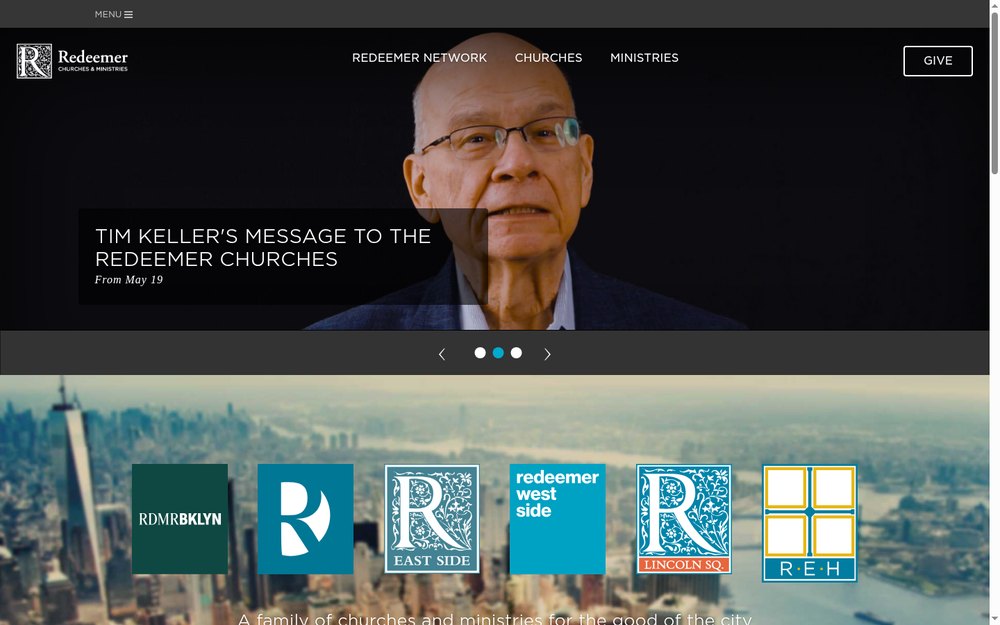
What it does well:
- Each church location, from Brooklyn to East Harlem, has its own menu link.
- Ministries such as counseling and faith-and-work programs are grouped separately.
- Giving offers one-time gifts, recurring gifts, and access to past statements.
- The mission is stated plainly on the home page.
What to copy: if your church has more than one campus or ministry, give each a clear home. Members should find their own campus in one tap.
| Website | Standout feature | Idea to borrow |
|---|---|---|
| Elevation Church | Many ways to attend, each explained | Treat online viewers as part of the church |
| Saddleback Church | First steps in the visitor’s words | Write next steps as "I want to…" lines |
| North Point | Service times right under the headline | Put the basics where nobody has to look |
| Redeemer | Clear structure for many campuses | Give each campus and ministry its own home |
A church website is a front porch. Keep the light on and the door easy to find.
The pages that do the quiet work
Beyond the home page, a few supporting pages carry a lot of weight. Guests rarely land on them first. They read them while deciding whether to visit.

What we believe
A short, plain statement of beliefs helps a visitor know whether your church fits. Skip the long doctrinal document on this page, or link to it below a summary. Two or three paragraphs in everyday words do more than a page of formal language.
Staff and leadership
People want to see who will greet them. Photos and a short line about each pastor and ministry leader make a first visit feel less like walking into a stranger’s house. Keep the page current when staff change.
Kids and students
Parents decide a lot of first visits. A kids’ ministry page should explain check-in, safety, age groups, and what children do during the service. North Point’s age-by-age breakdown is a good model.
Watch and listen
A sermon page with a search, series names, and dates lets members catch up and lets visitors sample your preaching. Add audio for people who listen on a commute. If you stream live, show the next start time.
Prayer and care
A simple prayer request form tells people the church cares between Sundays. Keep it short, and say who reads requests and how they’re kept private.
When you build a website for your church, plan these pages from the start. They’re easier to write before launch than to add later.
Common mistakes on church websites
The usual problem with a church website isn’t the design. It’s that the pages are written for people who already attend. Each mistake below is a place where a curious visitor leaks away.

Hiding service times
It sounds obvious, but many church websites bury service times on an "About" or "Visit" page. Put them on the home page, near the top, with the address and a map link.
Using insider language
Words like "Connect Card," "Life Groups," or a ministry’s brand name mean nothing to a guest. Explain what each thing is in plain words, then use the name. A first-time visitor shouldn’t need a glossary.
Letting the calendar go stale
An events page full of last spring’s potluck tells visitors the site, and maybe the church, isn’t active. Keep events current, or show fewer and update them on a set day each week.
Pages that are slow on a phone
Big hero videos and image sliders look nice on a desktop and drag on a phone. Google’s Core Web Vitals guidance says main content should load within 2.5 seconds for a good experience. Compress images, and let people tap to play videos.
Leaving some people out
Churches welcome everyone, and the website should too. Captions on sermon videos, readable text, and forms that work with a keyboard help members with disabilities take part. The W3C’s WCAG overview explains the standard that defines accessible web content.
Making giving hard
If giving takes more than a few taps, fewer people finish. A long form, a redirect to an unfamiliar site, or a missing recurring option all add friction. Make the Give button visible on every page, and test it on your own phone.
Now ask yourself: if a family found your church website tonight, would they know when to come and where to park?
How to apply these ideas to your church website
You don’t need a big church’s budget to use these patterns. Work through the list in order, because the early steps touch the most visitors.
- Put service times, the address, and a "Plan a visit" button at the top of the home page.
- Write an "I’m new" page that covers parking, kids, dress, and what a service is like.
- Post the latest sermon on the home page and keep the archive easy to search.
- Add a visible Give button with one-time and recurring options.
- List groups, serving teams, and events, and keep them current.
- Test every page on a phone, and fix anything slow or hard to tap.
If you build on WordPress, start with designing a website with WordPress for the basics of themes, pages, and plugins. Speed matters too, and mobile website design and performance basics explains what slows a site down on a phone.
Keep your service times the same everywhere they appear. If the website says 10:30 and your Google Business Profile says 10:00, a visitor may arrive late and not come back. Check both whenever your schedule changes, including holiday services.
Seasonal moments deserve their own pages, too. Easter and Christmas services often bring more first-time guests than a typical Sunday. A simple page with times, parking, and kids’ details, posted a few weeks early, gives those guests a reason to return.
Who updates the site matters as much as how it’s built. Pick one person to own the calendar and sermon uploads, even if volunteers help. After launch, plugins, forms, and giving tools need regular care, and a website maintenance plan keeps them working.
Write every page for the person who hasn’t walked in yet.
Best church websites FAQs
What should a church website include?
A church website should include service times, your address and a map, and a page for first-time visitors. Add your latest sermon, online giving, kids’ ministry details, groups, and events. Contact information and a short statement of what your church believes help visitors decide whether to come.
How much does a church website cost?
At White Peak, website prices start at $1,500, and most websites cost $3,000 to $10,000. A church site’s price depends on the number of pages, sermon and giving integrations, event calendars, and who writes the content. Every site is custom, so the quote follows the scope.
Should a church use a website builder?
A church website builder works for a small congregation with a simple site and a volunteer to run it. Churches that stream services, take online giving, and run many ministries usually outgrow a template. WordPress gives more room to grow, though it needs regular updates and care.
How do churches accept online giving on their website?
Most churches use a giving platform that connects to their website through a button or an embedded form. Look for one-time and recurring gifts, a mobile-friendly form, and giving statements for donors. Keep the Give link visible on every page and test the full process yourself before launch.
How can a church website reach more people?
Make the basics easy to find, publish sermons people can watch and share, and keep events current. Then help people find you with a complete Google Business Profile, local search basics, and fast mobile pages. A site that answers a newcomer’s questions turns online interest into first visits.
Getting help in Reno
If you take one thing from this, build your church website for the guest who hasn’t visited yet.
White Peak is a web design and digital marketing agency in downtown Reno. We build websites for churches, nonprofits, and local organizations in Reno, Sparks, Carson City, Truckee, and nationwide.
If you’re planning a new church website, our web design in Reno team offers a free consultation to map out what your congregation needs.